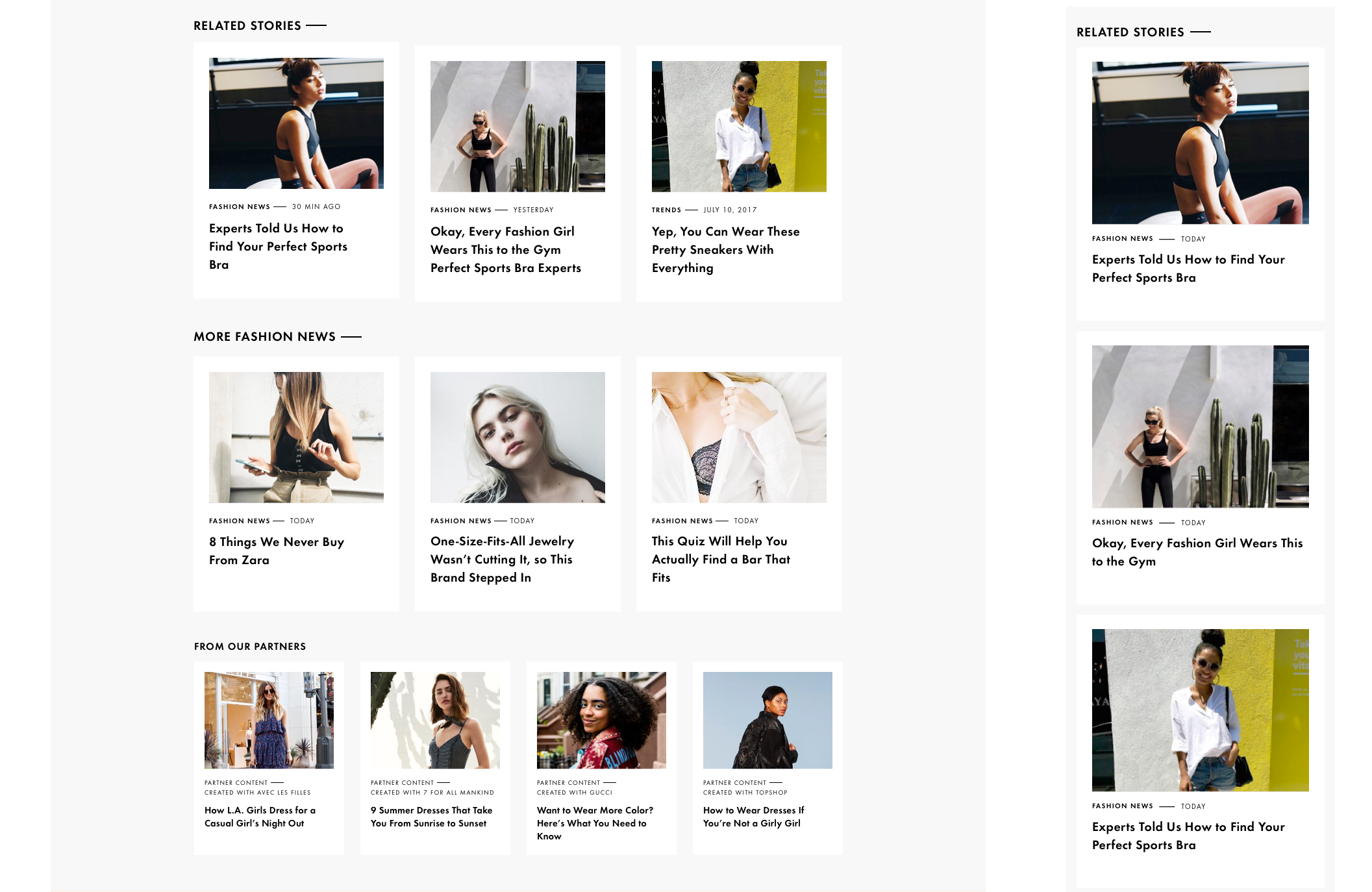
Responsible for: High fidelity mocks. Designing new discoverable content widgets for article pages, section pages and home page. While also solving for a more standardized image ratio, content layout, social icon and hyperlink options and working around intrusive display ads.
Context and Challenge: At the time, our site had scroll-into-next behavior with a high drop off rate. This never-ending river feed of articles also made it difficult for the user to find relevant content. Section pages did not perform well. Users were not engaging with the rest of the content once on site.
Process: Based on popular headlines and most viewed articles, our audience was very interested in commerce integrated articles and gallery widgets. Our strengths along with our authors voice was the ecommerce integration, the curated collections of products and where to buy them. By updating out SEO practices and refining Google amp article stylings click though to site was up 10% but our drop off rate was still high and our scroll depth only 1/3 deep for long form articles.
Design: I made very minimal changes to the UI components in the beginning of my exploration. I knew that a larger redesign moment was coming down the pipeline. While I was researching other media sites and looking for inspiration. I quickly mocked up all instances where we could improve on to discuss options to scope out the amount of work and set priorities.
